Comparing Step Counts: Apple Watch, Fitbit Charge HR, and iOS Withings App
For the past several weeks, I have been wearing an Apple Watch (nerd bling!), a Fitbit Charge HR, and not exactly wearing but still carrying my mobile phone like all the other technology addicted almost-middle aged people out there. The phone has the Withings app on it because I track my weight so that I can cycle back and forth between exuberance (Alright! I lost 5 pounds!) to bummed out (And I just gained 7 pounds. PBBBBBBT!!!!). The Withings App tracks steps based on the M7 chip inside of my iPhone 5S (why yes, I give Apple a lot of my money, thanks for asking). So I wanted to see how the three compared to each other. This is a casual comparison - I'm not running statistical tests or anything this time around.
The ground rules
After getting my Apple Watch, I decided to do this comparison thing. I was going to wear both the Fitbit and the Watch each day as I normally would. What's normal? When I wake up in the morning, I put on each device. The Watch goes on my non dominant (left) arm. The fitbit goes on my dominant (right) arm. I wasn't picky about which went on first - usually, it was whichever I could fumble and grab first. I decided some time ago (about when I discovered my wrist was getting sort of smelly from the fitbit charge) that I was not going to wear any devices at night nor track my sleep. (Yeah, bad self tracker, I know.) I set the recording of each device to the correct arm according to their corresponding apps. I carried my phone with me as I would normally - which means it goes with me to breakfast and goes with me when I walk the dog in the morning. When I get to work, it stays with me for the most part, but I will forget and leave it on my desk. At the gym, it sometimes goes with me onto a treadmill but it might also linger in the locker. If I am going to be going into water, like the pool or the beach or into the shower, I take off all devices and keep the phone away from water. For the most part, I went about my life.
Normal life involves walking the above mentioned dog, going on outings with the family, doing simple social activities with friends, and working at a job that involves a lot of sitting near a computer and cursing at the photocopier. I occasionally forget my phone for some reason, panic, and then gradually accept that I am phoneless for several hours. That is normal, and I did not track what days I left my phone somewhere. That is just life. I was trying to run an experiment that was fairly true to my life.
For days tracked, I picked the window between 6/3/2015 and 7/21/2015. Are these special days? An anniversary or obscure holiday? No. I got the watch on the 2nd, but it was late in the day so I didn't have a full day of data on that whereas the other devices/app had more time to be attached to my person. I actually wanted to go all the way through July, but my phone had been having issues and I had to get it replaced (hooray applecare! and yes, more money to Apple for applecare), so I lost Withings step data after the 21st. That's why we end then.
Getting Data Out
QS Labs was kind enough to release an iOS app called QS Access that let me get a .csv file of my Apple Health data. (Note: when I peak at the data in the health app, it seems that some of the data points, like a span of a minute or two, is from the phone rather than the watch? But I didn't care enough to dig into it and assume this is apple being smart about getting a more thorough picture. I'm sure I can read some message board and get a lot more details, but I'm just calling data from the health app "watch data" even though it isn't 100% true).
Fibit data I grabbed from the dashboard of Fitbit. I know there are hacks to grab data - in fact, I'm associated with one of them that will grab it in minute increments - but I just wanted to compare daily totals. Maybe one day in the future I will look at minute by minute or hour by hour or some other increment to see if there is something cool going on.
Withings lets you just export .csv files from their web interface, so that was easy enough. Just a few clicks here and there. Then stick it all into a spreadsheet and make a few plots. Again, I'm being lazy about this and am not running any serious statistics. I have had the most experience with Fitbit devices (I once tested the zip against the flex and saw the flex undercounted quite a bit relative to the zip), so I figured I'd use the fitbit devices as a baseline. Anyway, here are the results.
Result 1: Fitbit Charge HR tends to count more steps
If you take into account my previous experience showing that the flex seemed to undercount relative to the hip based clip on zip (which is more similar to research grade pedometers that exercise science people use), then we might assume that the Charge HR undercounts relative to whatever is my true number of steps. (Also, published research suggests as much). No matter though - I'd rather have an undercount than overcount so that I push myself a little more. But what is interesting is that the Charge HR, assuming it was undercounting, was counting still more steps than the other two. See the poorly labeled graph that has not been cropped below.

You would think I could keep a legend, but no. The Green is Fitbit Charge HR, Blue is Apple Watch, and Yellow is the Withings app.
The Apple Watch and the Charge track pretty close, but the green always seems to be a little higher. If you want to see how much of a deviation there was each day - in decimal approximations, then just keep scrolling.
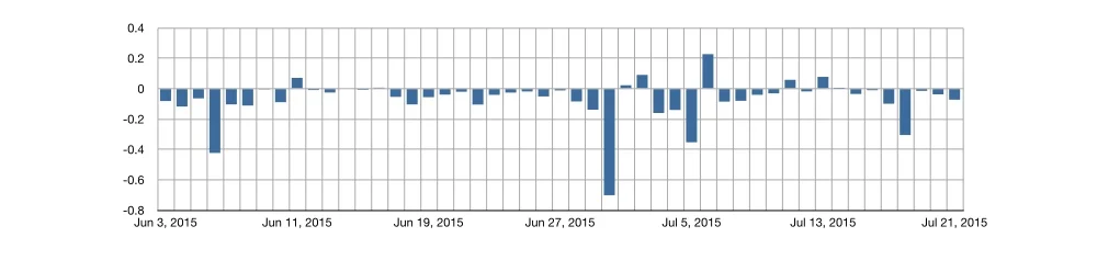
This feller shows how much the Apple Watch count deviated from what the Charge HR recorded. The decimals correspond to percentages, but I just didn't feel like actually making it show as a percentage. Anyway, the shorter the bar, the closer the numbers were. Bars that point downwards are undercounts. Bars that point upwards are overcounts. You can see that it's pretty close with 4 days that undercounted more than 20%. The overcoats were on 6 days, and only one of those was over 20% off.
So the conclusion here is that a Fitbit Charge HR on the dominant hand seems to count more steps than an Apple Watch on a non-dominant hand. Presumably, the algorithms that they use in each would account for dominant/non-dominant. And for the days that the counting was way off, I'm willing to believe something dumb happened that I don't remember, like a battery dying. (It happens.)
If you want to see it as being like a correlation, here's that plot.
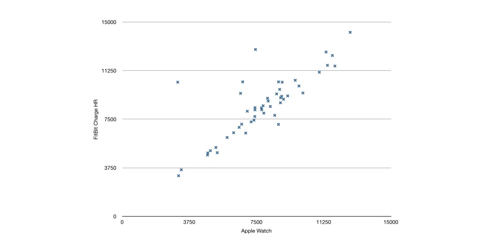
The numbers on the axes are step counts. Probably should have mentioned that sooner, but you probably figured it out, right? If not, sorry. The very first graph will make more sense now. Like I said, poorly labeled!
If you ever took a statistics course, you probably covered correlation. You probably saw the pictures of magical correlation of +1 or -1 (everything lies perfectly on a line of slope +1 or -1) and a correlation of zero (which, if memory serves, was always like a perfect dot filled circle in the textbooks. But let's not start on that - there is a cottage industry of ranting against textbooks and I even did a chapter of my dissertation on that which eventually became a journal article.) Anyway, this has an upward line that looks +1ish, although there are some points hovering above the line (Apple undercounts relative to Fitbit). I didn't want to run any statistics, and a correlation barely counts because it's like a click, drag, and button click in your favorite spreadsheet program - so here it is. For these two, r = 0.81. That seems like a pretty high correlation. It's not 1, but getting a 1 is pretty darn hard.
Okay, how about the Withings? Again, relative to Fitbit's thing, we get the following deviation plot.
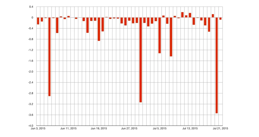
The bars are red because they are like tears of blood. Sometimes it overcoats (like 9 days?) and the rest of the time it undercounts. But when it undercounts, IT REALLY UNDERCOUNTS. There are a lot more days that are more than 20% off. And not like a sale price 20% off. It's like "WHOOPS!"
So it turns out that forgetting the phone at home or in the car or on my desk makes it a bad step counter. Who would have thunk?! But still, assuming I'm good about carrying my phone with me on the days that don't have the super sad droopy red bars, it's still a pretty big deviation.
Some time ago, there was a hubbub about some study about smart phones being reasonably good compared to a wearable tracker. Of course, the news media went to town with it and said wearable trackers are the worst thing ever and so take that you annoying techno-posers! But the study actually said that smart phones are a reasonable approximation when you have people doing something like....walking on a treadmill for a science experiment. If you don't have or don't want a wearable device but want to track, then by all means, use your phone! (Just don't forget it at home or in the car or on your desk). But if you want numbers that are a little...um, higher? Then a wearable that you don't have to think about leaving in the car or on your desk is fine. At least it works with this guy who has two thumbs and devices on each arm.
Correlation now? Here it is for the Fitbit vs. the phone app.
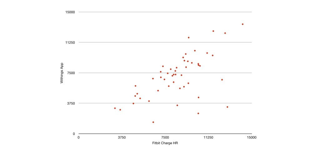
Just to confuse you, the Fitbit Charge HR steps are on the x-axis instead of the y-axis.
Well, that plot is sort of line like - it looks more like a line than a dotted circle. Heck, if I was a sociologist and got this as my plot, I'd probably start doing the Mipos Dance of Joy! (I'd also try to hide the fact that my N is so small). But doing that click, drag, button trick gives me this: r = 0.60.
That's not terrible. It is certainly a good approximation, and I am saying this without actually looking at any data but imagine this is probably close to the correlation of height and weight of american adults of a certain age. So it isn't bad - you can get reasonably close (if you remember to carry the darn smartphone everywhere, which we think we are good at, but I can't even tell you the number of times the words "Do you know where I put my phone?" are uttered each day in my house.)
What's that, you want one more correlation? For fun? Okay. The remaining pairwise correlation.

I moved the Apple Watch counts back to the x-axis just to be annoying.
This last scatter plot looks sort of like a dragon? Probably because it is green, but I can kind of make out a neck and a tail. It seems the least pretty to me, but since Game of Thrones became a thing, my relationship to dragons has changed. I'd still be delighted if I were a sociologist (and ashamed of the N - let's not forget the shame). R = 0.82. So that's not bad if we use the Watch as our baseline? But like I said before, it seemed like the Watch might get some of its step counts from phone accelerometer motion, so that could be part of what's going on.
Parting thoughts
Well, I'm happy to use all three device options (especially because the Watch is useless without the phone) even though I'd get double the wristband tan. However, I've scaled down to one for now (the Watch - Apple nerd bling makes me care more about things that do not relate to data, like overpriced beauty). My hunch is that the Fitbit does a better job of getting closer to "REAL" steps, but we are a long way from any wrist-based or handheld device being able to getting to that level of accuracy. I could elaborate on that hunch, but I won't right now.
And I know there are a bunch of different analyses I could and should do - average counts, significance tests (okay fine, paired t-tests are all significant at the 0.01 level), weekends vs. weekdays, excluding some outlier days, etc.). But if you want my tl;dr (which you wouldn't know about because I put it at the bottom and if you dr'd it, you wouldn't know it's here), it is that phone apps don't seem as reliable or consistent compared to a wearable device when situated in the actual world of human use, as determined from this human's use. Beyond that, pick your poison. More steps can come out of the Fitbit wrist-worn device, which makes it an attractive option. That is, until you make and sell something with the Apple logo on it. Then all bets are off.
Oh, and my team published a case study of a tween girl who came to a similar conclusion that you can read here. And the whole question of accuracy is something that a bunch of elementary school kids explored too. We published that also, and one day it will be freely available.